Maximalist Color Palettes — Australia
A practical guide to vibrant, layered palettes for Australian homes — balancing sunlit rooms, coastal influences and sustainable materials.
- Bold contrasts tuned for Aussie light and coastal interiors
- How to pair textures & finishes for longevity
- Practical tips for rental-friendly accents
Why maximalism works in Australian homes
Maximalism isn't chaos — it's curated abundance. In Australia, natural light and open-plan living mean bold palettes read differently across a day. We recommend anchoring saturated tones with tactile neutrals and natural timbers.

Signature maximalist palettes
Coastal Carnival
Deep teal anchors sunlit rooms; warm ochre and coral bring lively contrast. Pair with weathered oak.
Urban Botanica
Lush greens with soft creams and rose accents — ideal for courtyard-adjacent living spaces.
Sunburnt Pop
Inspired by inland hues — terracotta, citrus and midnight accents create dramatic layers.
How to apply: rooms & finishes
Living room
Use the dominant colour on large upholstery or a feature wall, neutralise ceilings and trims. Introduce metal finishes in warm brass or aged chrome.
- Rugs → pattern to repeat accents
- Curtains → semi-sheer to soften light
- Art → repeat one accent hue across pieces
Kitchen & dining
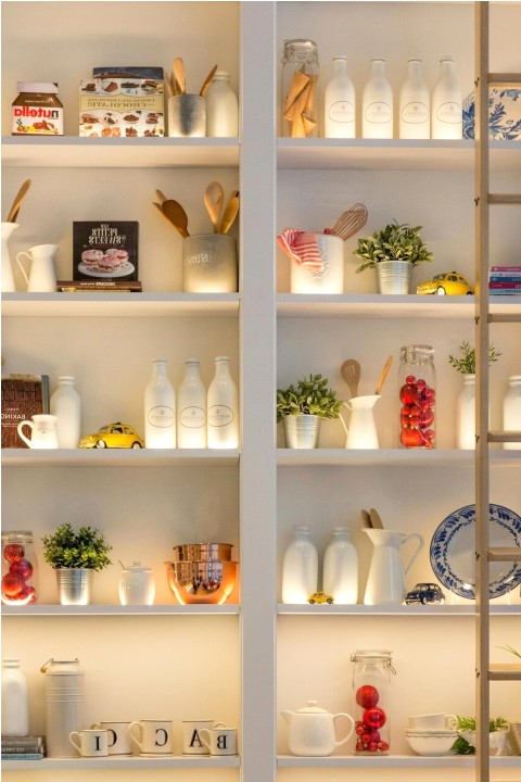
Cabinet fronts are perfect for bold colour. Ground the palette with stone benchtops and timber shelving to avoid visual fatigue.
Palette builder (interactive)
Use the accordion to explore mix-and-match suggestions for dominant, accent and neutral roles.
Case studies — client rooms

Brighton Terrace — family lounge
We layered saturated teal with ochre accents and reclaimed timber shelving to create a playful yet grounded living area. Natural fibers keep the scheme welcoming for children and pets.
Melbourne Apartment — bold entry
Coastal Weekend House — eclectic palette

Practical tips & maintenance
- Test paints at different times of day under natural light.
- Protect high-contact surfaces with durable finishes and washable textiles.
- Use removable wall panels or large artworks for renters wanting bold looks.